If the photo looks the way you want it to look, it is a great photo. Oh, you are not sure how you want it to look.
I have often wondered and studied how I want my photos to look. So, I boiled my study of that question down to five characteristics. Maybe my study will help you answer the question you ask about your own photos. Read on, I’ll tell you of my study.
First click on the TGO Photo Club page in the left column – Eileen Norington, Jim Dick and Dave Cesari have posted some really great photos there. Dave showed us some birds in the northern white stuff, Eileen showed a Florida bird huddle up to keep warm in our Florida cold spell in the 50 degree range (Ha Ha), and Jim showed what what he finds on TGO’s wonderful nature trails.
——————-
Now, some back ground on my studies and some examples of photos I messed with to illustrate my findings of five photo characteristics.
Did you know that all digital cameras record some form of AR – AUGMENTED REALITY – Each camera setting changes in some way true reality. Therefore to some extent we photographers are recording a modification of the truth. We use aperture, ISO, shutter speed, white balance, telephoto lens, CMOS recording sensor, and other camera/software components to help create an image of reality that has been modified.
Companies like Nikon, Microsoft, and Facebook are forecast to spend $20.4 billion, in 2019, to develop hardware and software to help create AR (Augmented Reality). AR is like the computer was 60 years ago – in its infancy.
So, what makes an AUGMENTED REALITY image better than a true reality image? I have been studying that question for months and hope to study it for years. Over those future years I hope to follow the the development of the products developed with $20 billion spent to create AR images this year.
Even if I am not qualified to to teach AUGMENTED REALITY, I want to pass along to you what I learn. Maybe, I want to teach you because teaching forces me to learn. Sixty years ago I accepted an opportunity to teach a gradate level Industrial Engineering Statistics course, using a brand new device called a computer, at the University of Pittsburgh. I learned everything I taught the day before I taught it.
One day at a time, that is how I learned and taught computers and, thus, enjoyed a 60 year career built around the computer. Now I want to learn – and to encourage your to learn – digitally AUGMENTED REALITY. Hopefully, we together, will enjoy learning what makes a photo good for us, the beholder.
So far, I have boiled my study down to these five characteristics for evaluating my photos:
1. Controlling the mood of an image using light
2. Making all 4 corners different, applying the rule of thirds, and making use of letters and angles to create a good composition.
3. Bringing the viewers eyes back to the subject using proportion and values (shades of color)
4. Making sure that the subject is surrounded by a setting that tells the subject’s story
5. Using depth of field to reduce clutter
EXAMPLES of my use of these five characteristics:
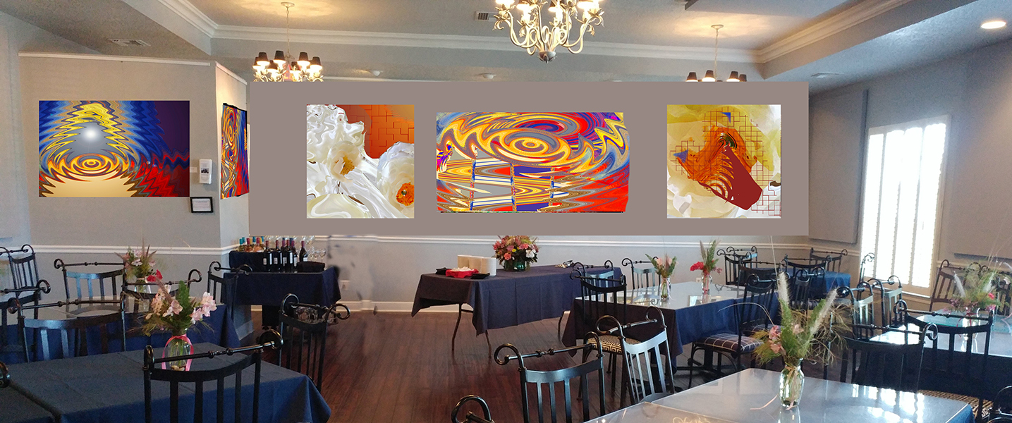
USING LIGHT: These photos are really AR – I augmented a “real” photograph to create each of these abstract photos – I controlled a lot of light in the augmentation. But the question is, did I use light in the abstract photos to make this room bright and cheerful? That is how I wanted my photos to look.
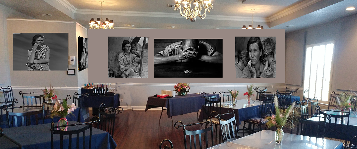
USING LIGHT: Here are 5 great photos by the famous Dorothea Lange, depicting the years of the great depression – In each photo, I think, she “controlled light” and posed folks to depict the plight of people in the depression. – By hanging them here did it change the emotion of the dinning room? That is how Dorothea wanted her photos to look.
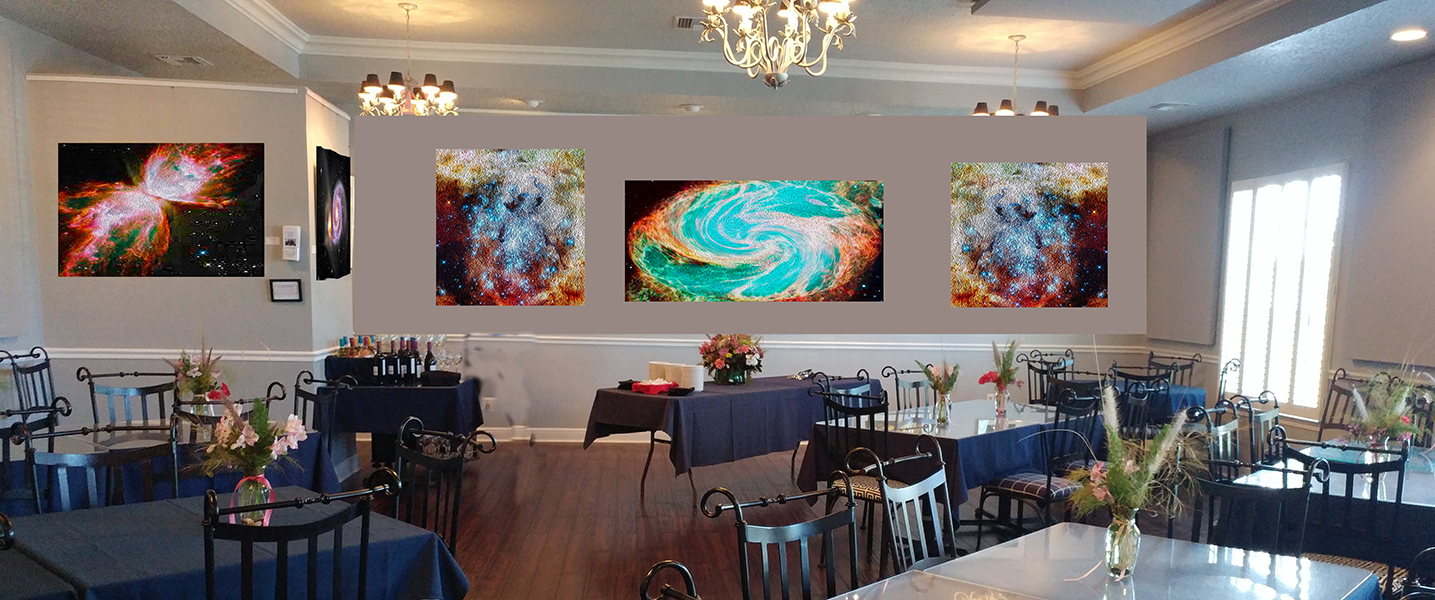
Photos from the Hubble Space Craft are real – and bright – and they send a message of our communities pride in being next door to the Space Center. Does their light – brightness – set a proud cheerful mood for the room? I choose them to give the look of pride and cheerful.

Just for fun, I did augment the Hubble Photos a little. See the “Blue Heron Restaurant” logo bird in upper right?
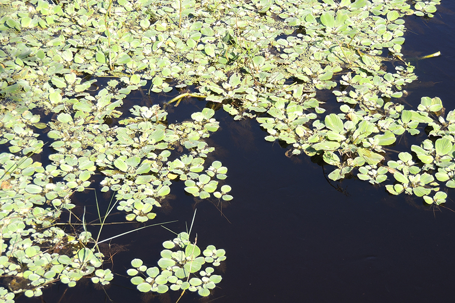
This is just as my camera recorded it. The camera washed out the photo and did nothing for my subject. I wanted your eyes to stay focused on the sticks surrounded by the invasive plants.
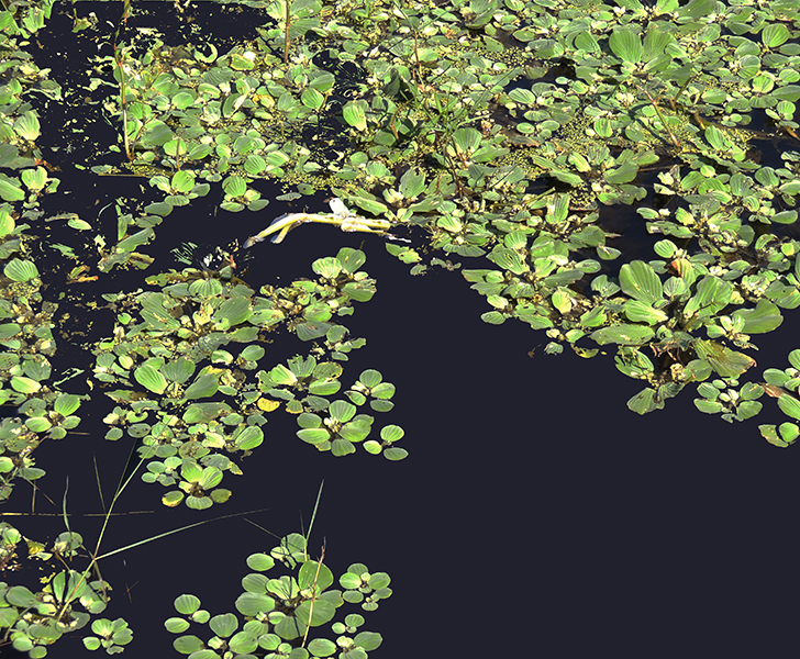
Hey – With Photoshop I altered the photo to make it much closer to what I wanted to show you. It is not so washed out (altered light), four corners are different, value contrasts by the stick keeps your eyes on the stick which in turn keeps you looking at the photo and not jumping off my photo. The “L” shaped letter of dark in upper left keeps sending you eyes back to the stick, and finally the grasses in the lower left are at an angle and they point point your eyes back to the stick as does the black area from the lower right point you to the stick!
By using the 5 characteristics I hope I was able to keep your eyes on this photo, so that I could use it to help tell the story of invasive plants. Anyway, that is how I wanted the photo to look – by definition that makes it a “good” photo.
I was reluctant to show you a PhotoShop modified photo – ’cause my goal is to help you learn what “makes” the photo you want. Then, encourage you to use camera position, camera settings, time of day, natural light, created light, and viewfinder composition to make the photo you want.
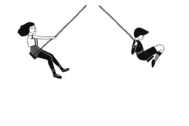
As you swing thru life, your photo is good, if it is the photo you want. I hope our Photo Club helps you learn to know what you want and helps you practice to get that “good” photo more often!
Leave a Reply